Powerwall Data Analysis
The Powerwall copped a hammering this week, with another really hot day in Sydney showing up to get everyone’s air conditioner roaring, and the good news is I can see how much.
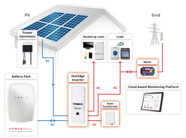
The SolarEdge inverter I have (SE5000 model for those playing at home) feeds back data to their HQ, which I can access through a web portal. At the moment I’m just taking screenshots to log interesting events, and provide feedback to everyone in the chain.
As you can see, its great from a consumer perspective to understand your power usage at-a-glance, as well as the Powerwall and panels data. So I know this week how much I’ve exported, used on my own needs, and what I had to take from the grid.
You can see that 25th Feb was the hot Thursday, with temperatures reaching 41oC in the shade. The ability of our family to tolerate that kind of heat is not pronounced, so the air conditioner goes on.
The big red spikes above the “4k” line represent our ducted air conditioner going on. Yep, its a hungry beast. Generally speaking, it seems to kick off around 5kW to run as an absolute minimum, and generally goes around 6kW, depending on the ambient (room) temperature versus the thermostat.
One thing I didn’t fully understand when I got my system installed was the power parameters. I have a 5kW inverter, that means the system can move 5kW from the panels and Powerwall as a maximum.
So, for example, if the panels are blazing and the Powerwall is full, but I need to run the ducted air, it is going to pull a maximum of 5kW from my panels and battery combined, and then go to the grid for the rest.
Yeah, bummer, right? Unfortunately, the house came with this A/C so there isn’t much I can do about it at this point, beyond mitigating my use of it and setting my house up a little better. More on that point in a later post, when I get more time to think about it.
So, back to reviewing the data, and let’s continue by just looking at the solar generation side of things – and to make it interesting, let’s drill down on the days leading up to the full moon (yes, the portal has a drag-zoom setup – its pretty cool).
So we have some nice, parabolic curves representing power generation during the day. The peak is generally around 2PM each day (keep in mind we’re in DST here) and quite often hits in around the 4kW mark. However, I’ve seen individual readouts above this. I guess the graphing software tries to smooth curves as often as possible.
This isn’t the best bit though – notice the little squiggles happening around midnight on each day? I’m told by the installer that customers have reported moonlight triggering the panels, and I guess, being photo-voltaic in nature they respond to any light bright enough. Yep, that’s right:
LUNAR POWERWALL!!!
Here is a zoomed-in version from the night of the 24th Feb through to about dawn on the 25th, showing the fluctuations. Not much graph smoothing here!
I’m kind of geeking out over this, in case you hadn’t guessed. Sure it isn’t a lot of actual power (up to 70 watts), but you must admit, that is pretty cool.
But going back to the top chart for a minute, you can see from the 25th onward a lot of red readout in the low-levels, meaning the Powerwall has ceased covering “Self Consumption”. The day after was cloudy, so little opportunity to replenish the levels.
After some awesome sunlight today with a nice cool breeze (no air con!), the Powerwall is sitting around 70% to get me through tonight and beyond.
It helps that we were out today, not using much power, and having an awesome lunch at Barbuto Restaurant in Narrabeen, followed by a stint on the beach in the afternoon. Great day!
Leave a Reply
You must be logged in to post a comment.